

Reaching Your Audience
Despite new technologies, email remains an extremely relevant promotional tool to reach customers, clients, and users . What has changed is the way people are viewing their email. More users are accessing their emails through various mobile devices. The emails you send out have to be formatted to display correctly to the greatest amount of viewers possible. This means following email design best practices to assure proper rendering across the many different email clients now available. What we have to keep in mind is that email is not web design; what works on a web page often will not work in an HTML email.
Designing For Email
Many companies want their email to resemble or be an exact copy of their websites. Email clients are not web browsers, their rendering is far behind what a browser can do. Therefore it is necessary to simplify your design. Just as there are vast differences between print and web, there are big differences between websites and email.
Layout
Avoid using drop shadows and background images, they are not well supported. Instead rely on background colors and clear divisions between your sections. Try to have little to no overlapping sections. The only way to create overlaps are with images; so use them creatively and sparingly. If you want to use a background image then go with a simple appealing texture and back it up with a background color that will match it well. This will assure your design remains strong even if the background image fails to display.
Typography
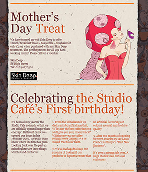
Keep your font choices to one or two web safe fonts. It is currently not widely supported to embed custom fonts into an email. Only use decorative fonts on logos and places where the text will be placed inside of an image and will not change. The current list of ideal fonts that will display consistently across a large percentage of platforms are Arial, Verdana, Tahoma, Georgia, Impact, Comic Sans, Trebuchet MS, Courier New, and Times New Roman. On the left is a great example on how attractive headers done as images can make a design look great and followed up by a web safe font in an appealing color scheme.
Mobile Friendly
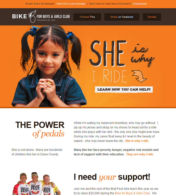
Design for small screens. Make your layout no wider than 650 pixels. This will assure that it can be visible on mobile devices without scrolling or breaking of the layout. Start out with a 650 grid and separate your email into easy to read sections.
Avoid The Spam Box
Be compliant with CAN-SPAM laws. Include an unsubscribe link and the name and address of your company. Do not use or plan to use anything that involves Javascript since your email will be marked as SPAM by most email clients. Do not overuse special characters or exclamation marks in your text or subject line, this is a classic red flag for spam filters. A good design will have a healthy balance of images and text. This rule also applies to CAPS. Writing too many words in all caps could mislabel your mail as spam. An email composed entirely of images can be confused for SPAM by email clients.
Design Accents
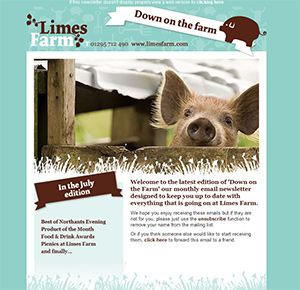
Borders are only partially supported so rely more on background colors than borders to separate your sections. A good way to section off your email is to use small design images. This is a good way to inject extra appeal using low bandwidth. Remember that many emails are read on mobile devices. We don't want our emails to use too much data. Look on the right for a great example of using an image based separator that adds a great deal to theme of the design.
The Limitations
Email developers have to code HTML emails using outdated coding techniques because email clients will not be able to render newer code. Design your emails with re-usability in mind. In the case of newsletters, you will want to focus more on content than fancy designs. Over using elements such as drop shadows, background images, and custom fonts will make it necessary to build the email using mostly images. Most email users have images turned off by default. This means your email will be unreadable unless the user decides to download the images. Over using images also makes it harder to update and create new versions of your email.
Branding
You can still have your emails reflect your brand by using color and header images effectively. Color scheme and logo placement go a long way towards giving your emails a unique look. Have your header colors match or compliment your background and logo colors. Trying to match the menu navigation of your website is a great way to link your emails to your web presence. You will be surprised at how much your email will compliment your brand while at the same time having its' own unique look.
Need help taking your idea from design to email?
Contact us and we can help you code your email to display properly on a wide array of email clients, browsers and devices.